Ajediam.com - Boutique jewelry & diamond retailer
My role
Visual ux / brand designer
Impact highlights
✨ Increased user engagement through a refreshed user experience, which boosted daily users from 150 to 400+ by 2024 and +24.62% average user retention.
Scope
1) company rebranding
2) design system creation, design of branded artefacts —implementing in cohesive user experiences across tools and layouts of the rebranded website
2) design system creation, design of branded artefacts —implementing in cohesive user experiences across tools and layouts of the rebranded website
Skills
Figma, Creative Cloud, typography and layout, atomic design, story-telling, brand strategy, product design thinking, responsive design


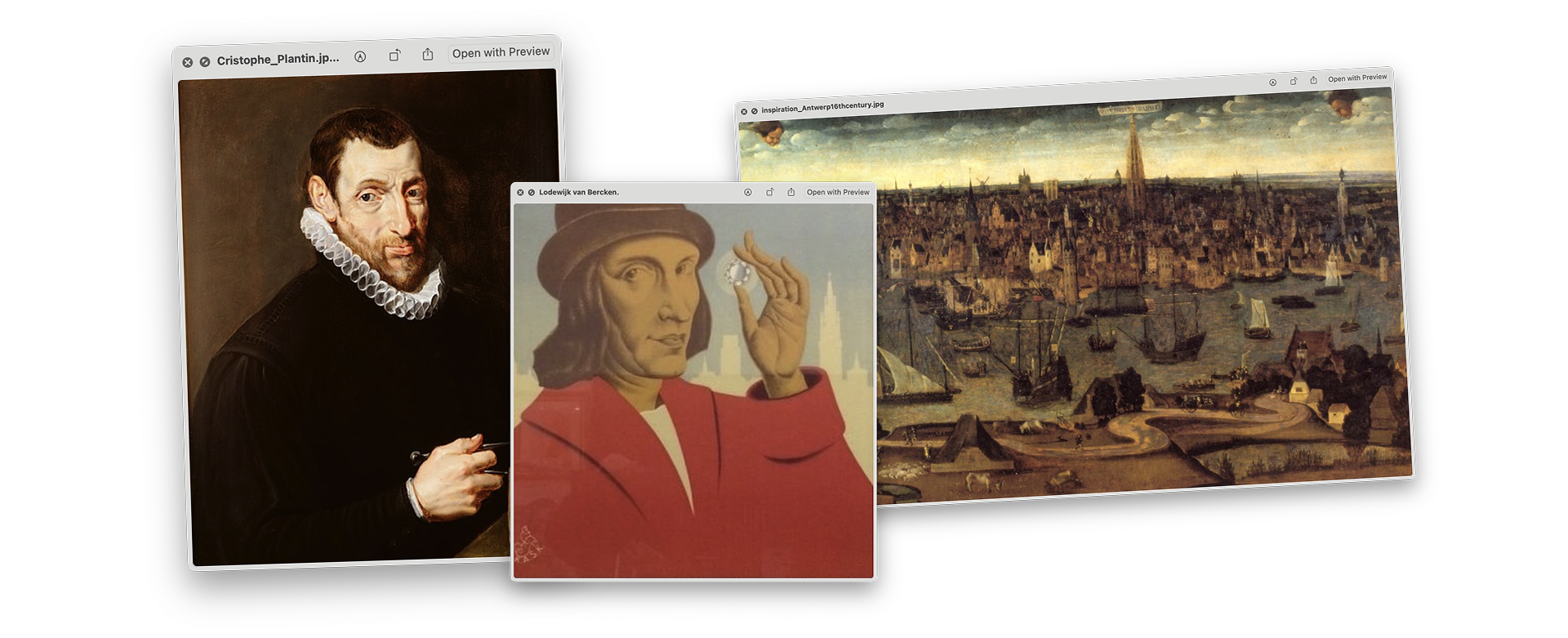
Ideation and Inspiration
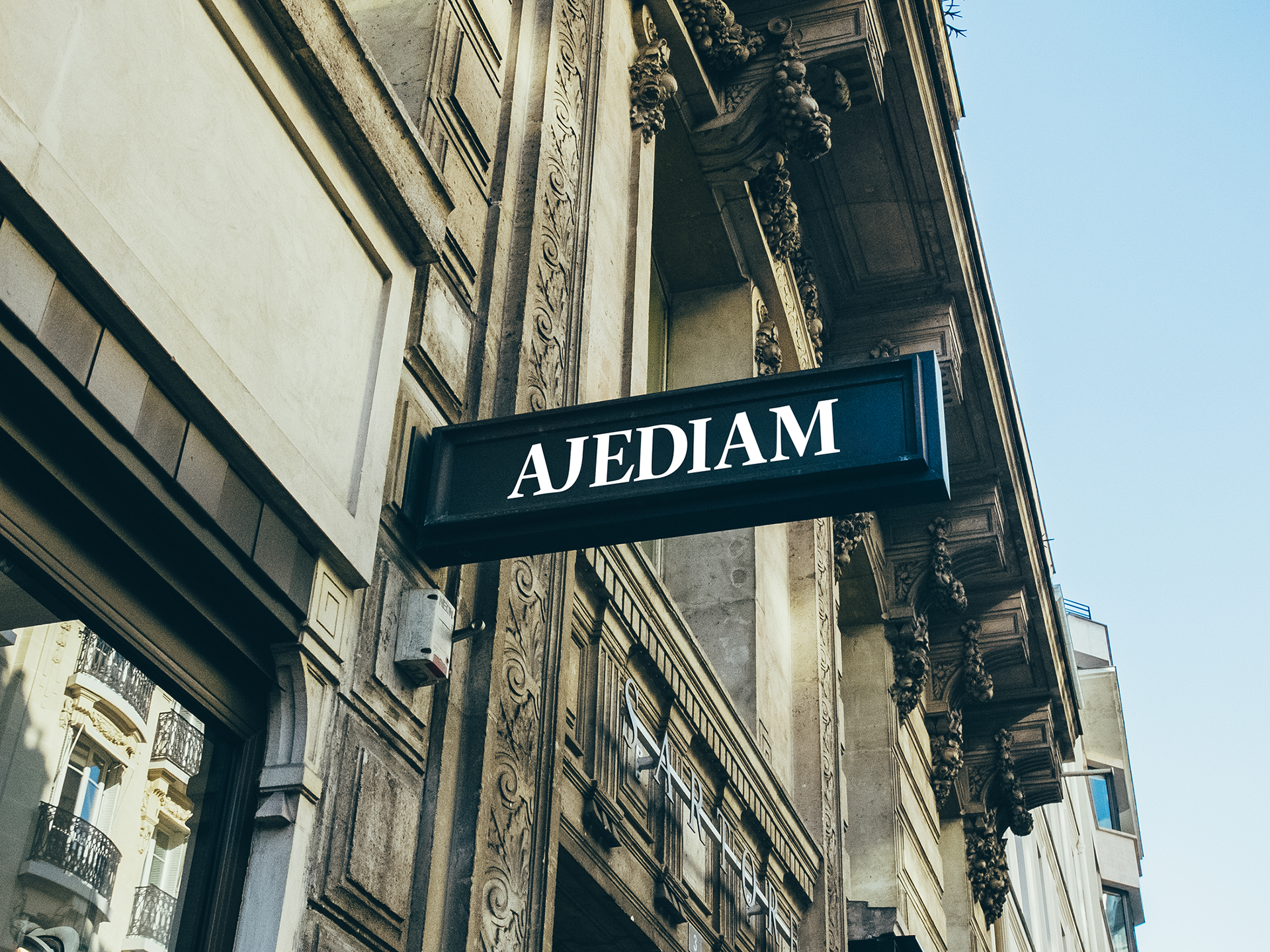
Symbols of flemish excellence
Ajediam's re-branding was started by identifying core values—legacy, trust, and establishment—and connecting them to the city's diamond trading heritage through typography and visual cues, bringing the rebrand's spirit to life.

Color palette
A benchmark study showed that these colors would both differentiate us in the Antwerp diamond industry and reinforce the brand's established identity.

Primary colors

Secondary colors

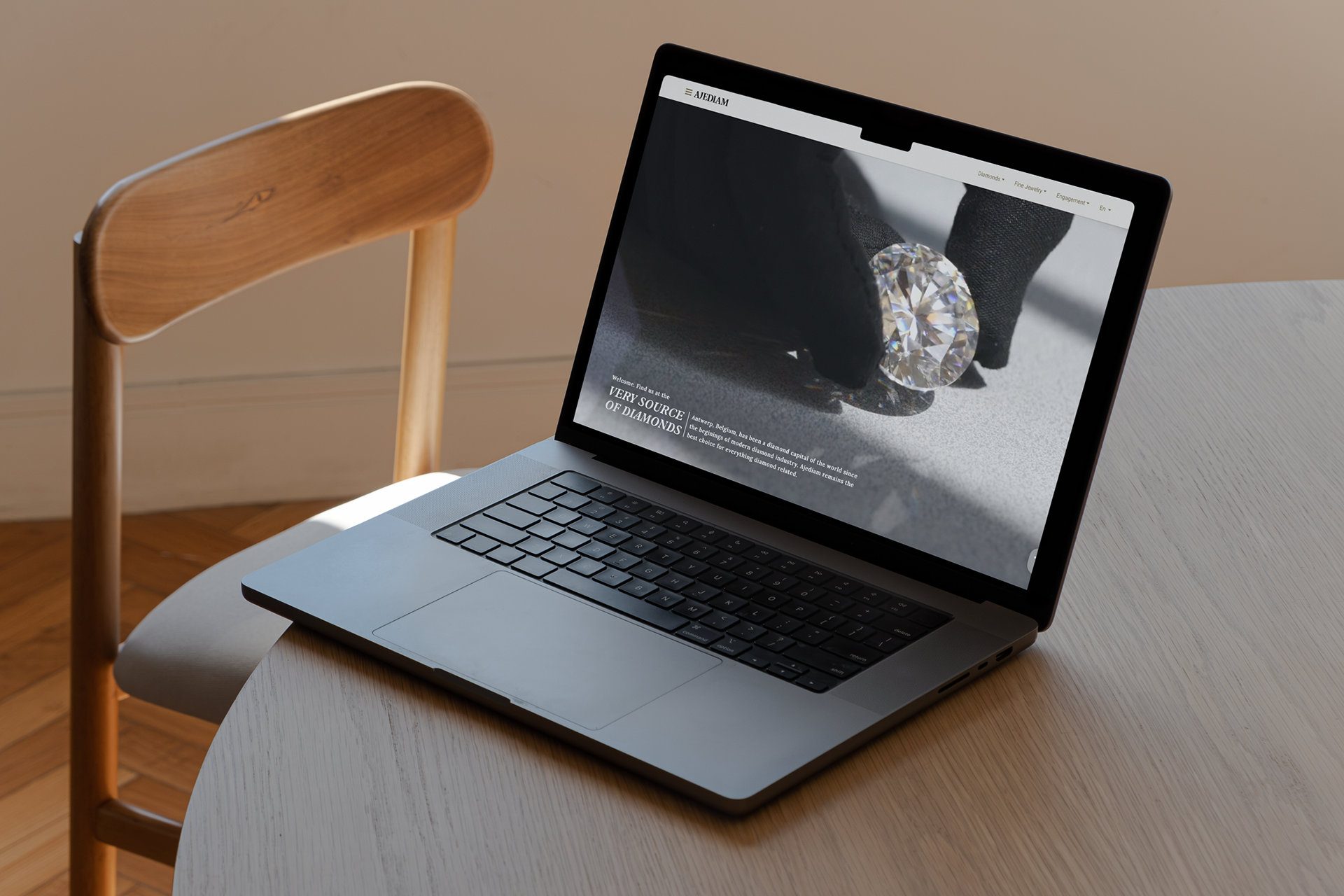
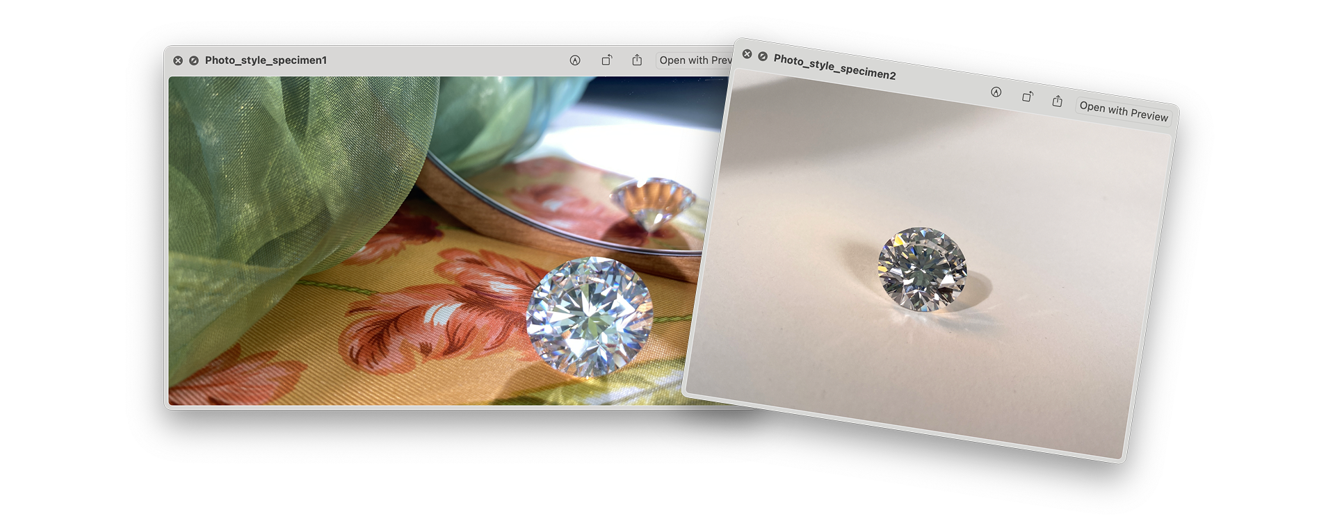
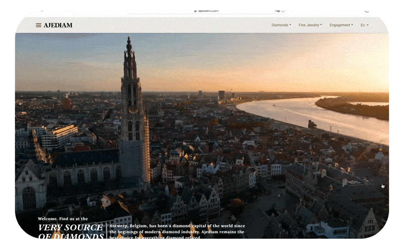
Setting creative direction: Photography
We established a distinct product photography and image style to be used throughout our multiple touch-points

Setting creative direction: Branded short form content
I directed these pieces from storyboard to final MP4, prototyping a visual style that resonated with the brand I was building — a framework vendors could easily replicate and I could oversee to produce short-form content that drives website traffic. below is a sample

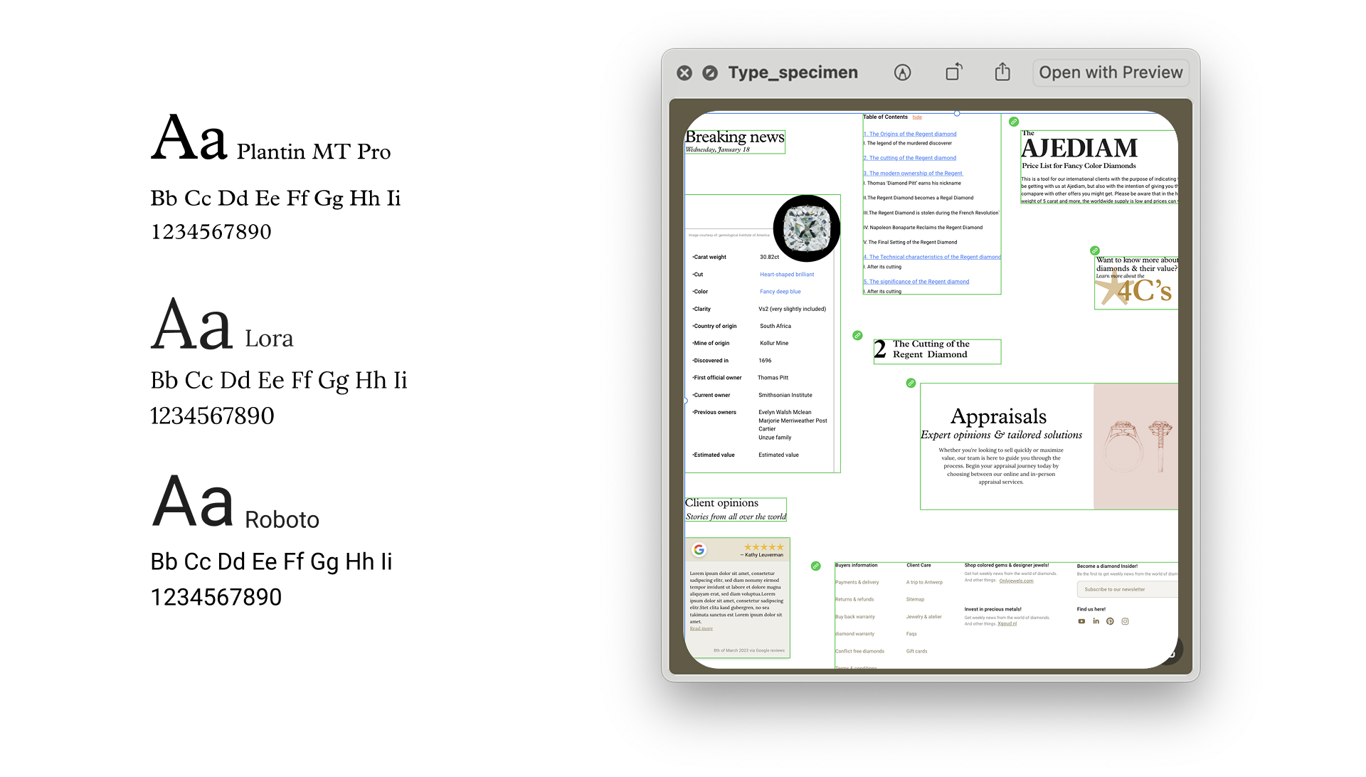
Typography: font pairing
Typefaces with belgian roots form a flexible design system to produce editorial quality, diamond educational material and other articles.

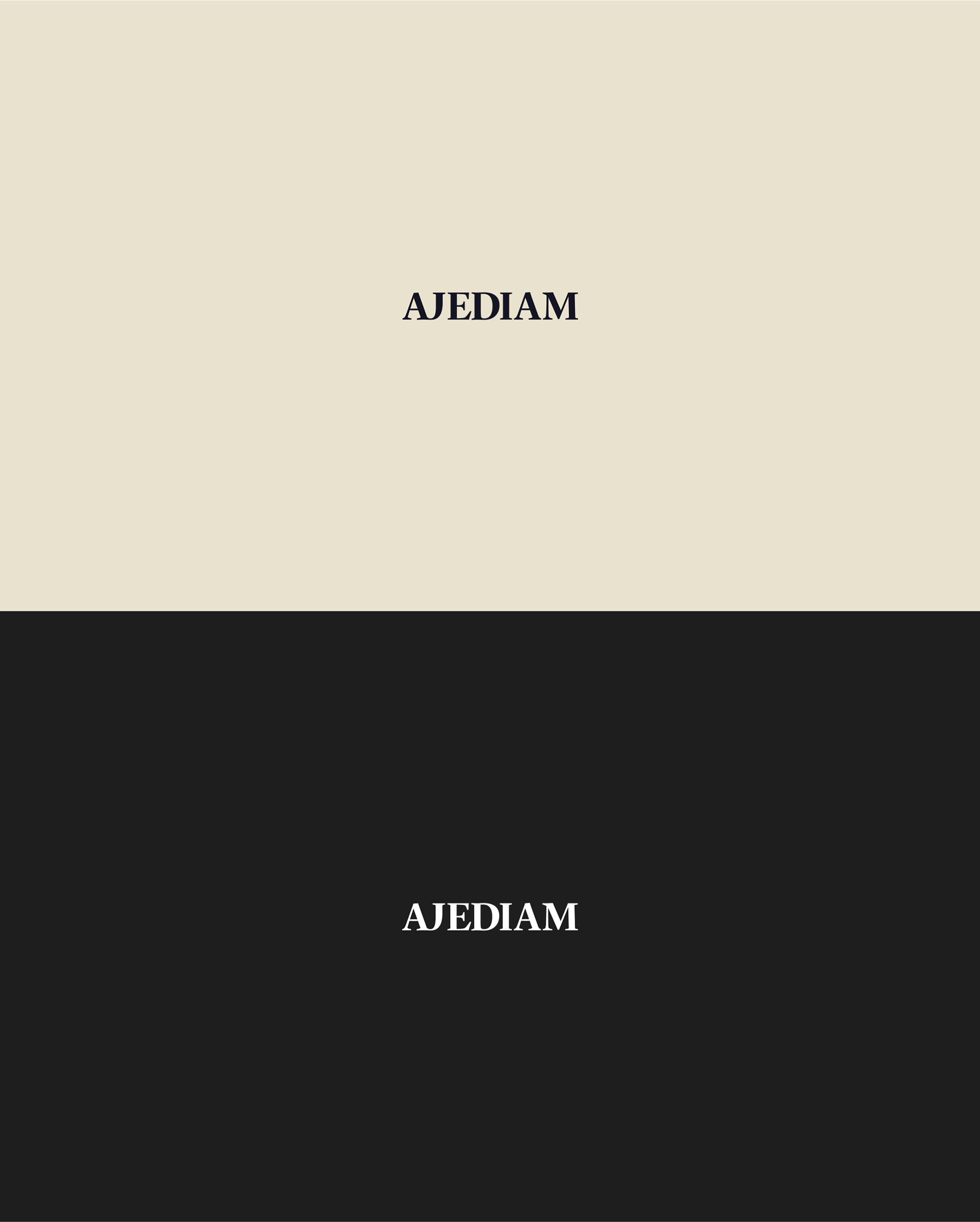
Typography: Wordmark
Guyot typography, a modern reinterpretation of Plantin with a ligature to enhance rhythm and render an identifiable word-mark

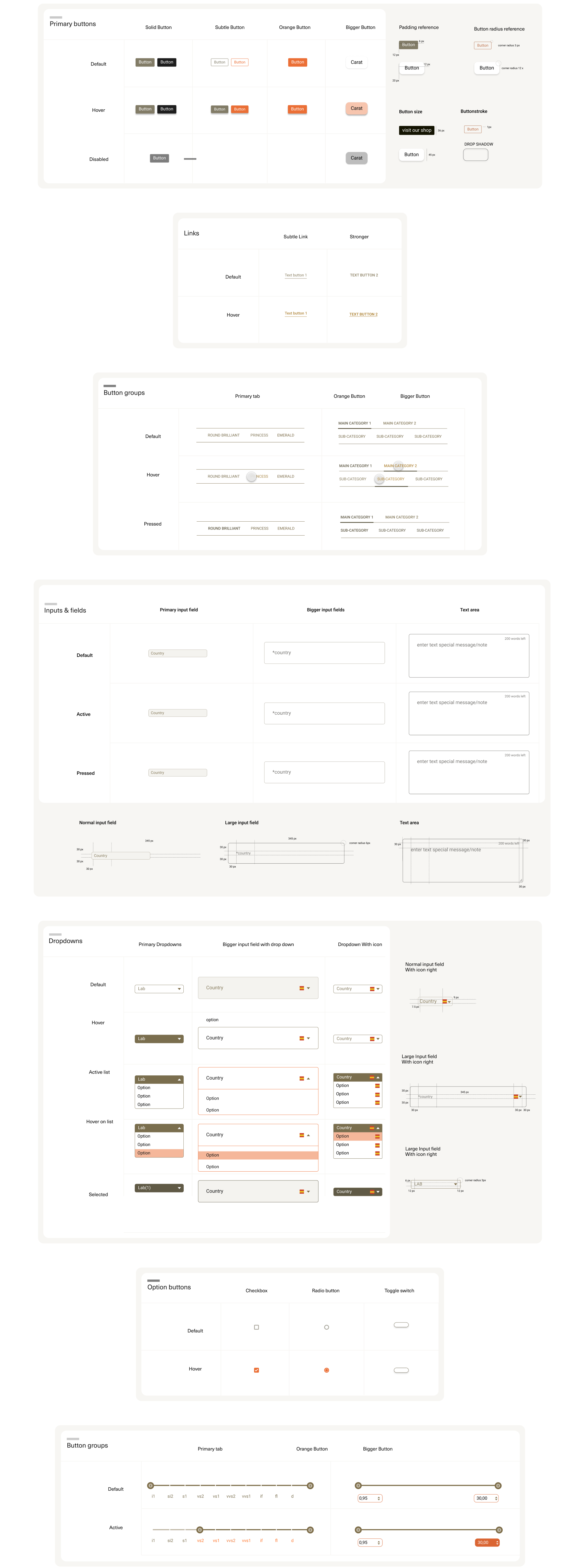
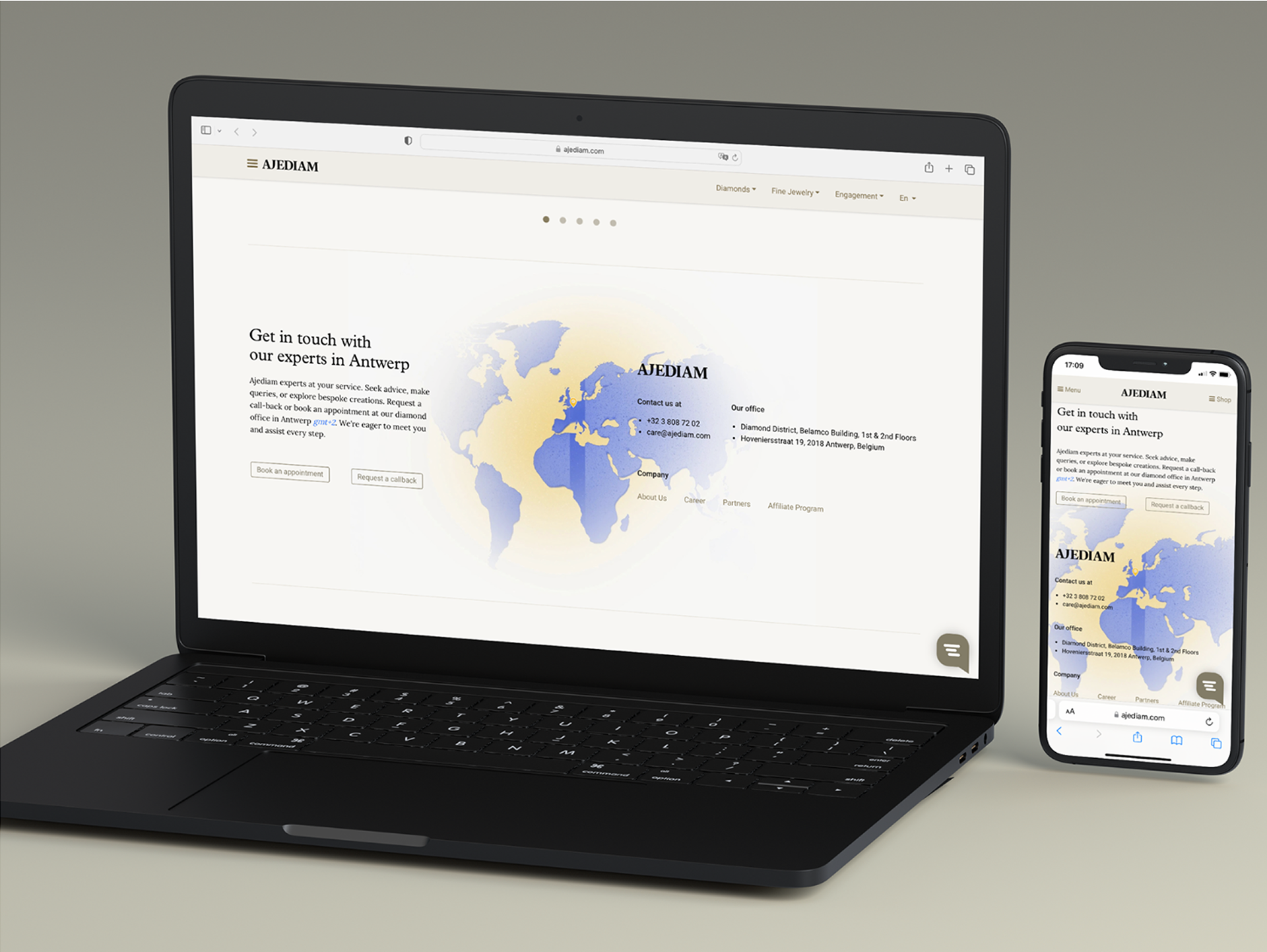
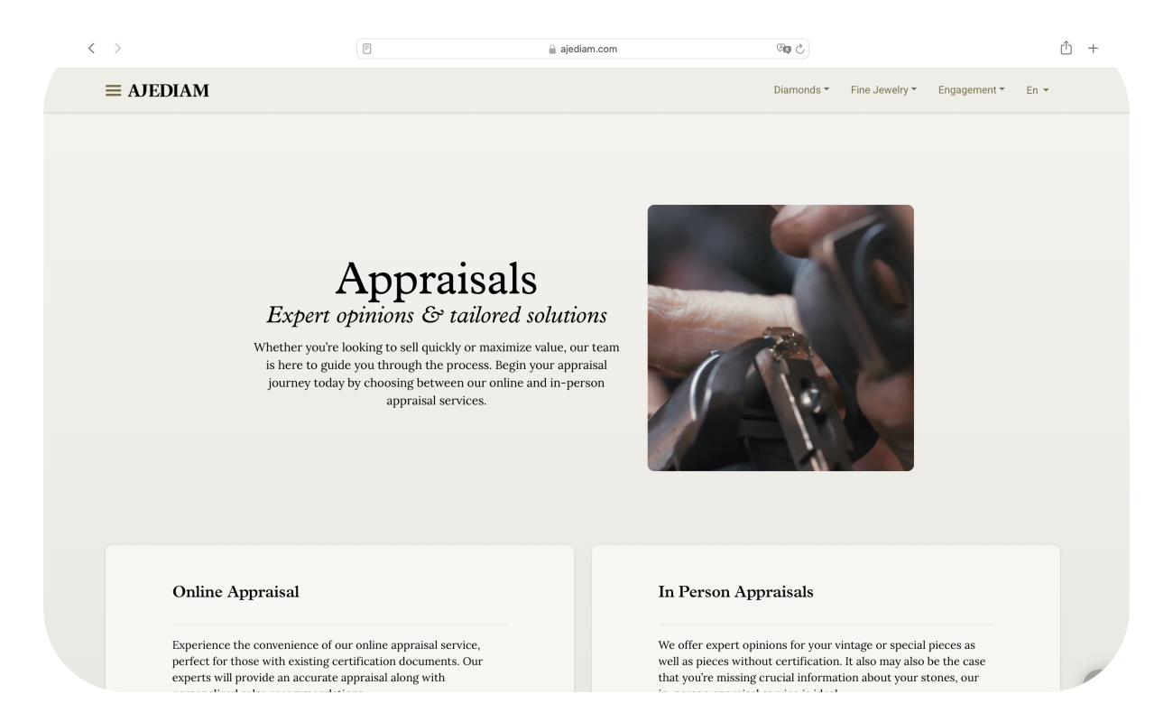
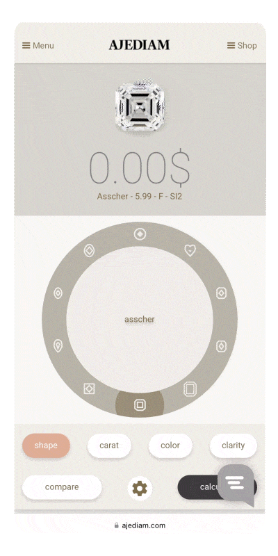
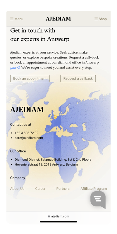
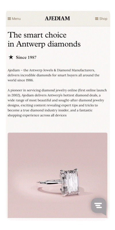
Design system: UI components
These are examples of user interfaces and visual treatments, where we can appreciate the rebranding applied to the UI


Design system: atomic design elements
The small pieces that conform the system used to build new pages and revamp older ones in Ajediam's refreshed website.