Spice Angel - An asian food product company
My role
Graphic brand designer
Impact highlights
Thanks to this project, Spice Angel was able to formalize their product and join popular distributors in Geneva, Switzerland
Scope
• Research to inform design decisions surrounding the wordmark
• thinking of a scalable system that involved the use of illustration and image treatments to construct a brand world that Spice Angel could draw from for products, content creation and design artefacts
• Design execution of packaging and editorial material using the established brand world
• thinking of a scalable system that involved the use of illustration and image treatments to construct a brand world that Spice Angel could draw from for products, content creation and design artefacts
• Design execution of packaging and editorial material using the established brand world
Skills
Photoshop, Indesign, Illustrator, Adobe Fresco for illustration

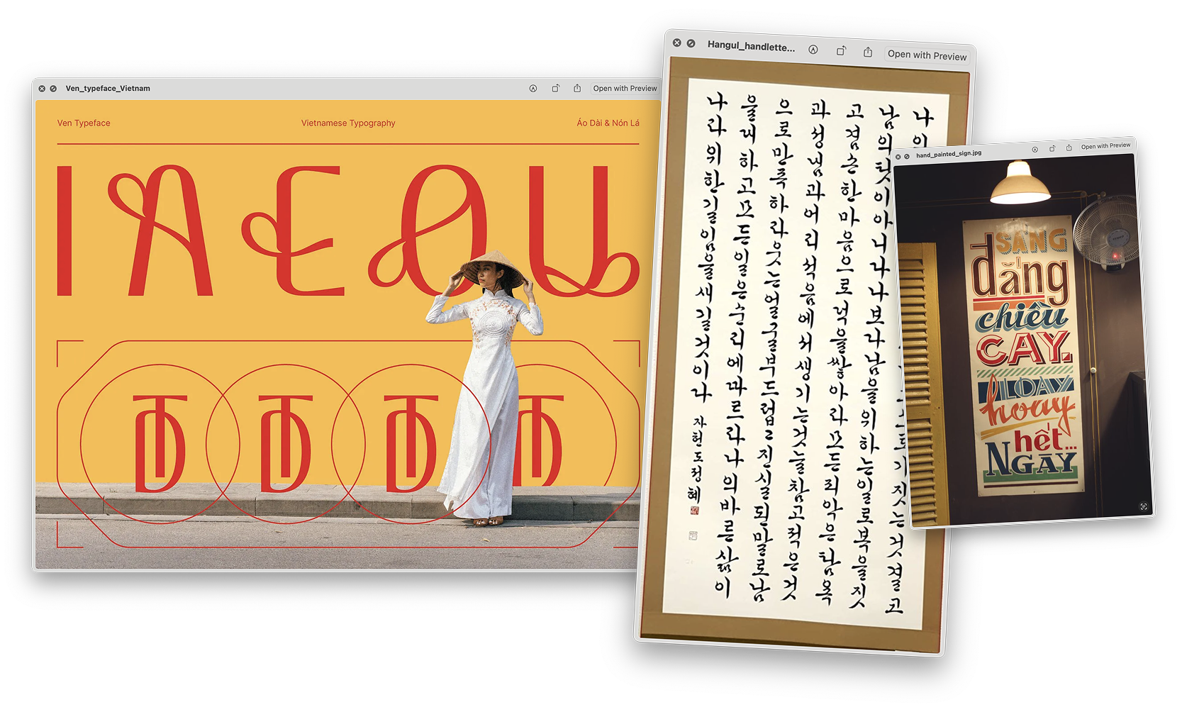
Ideation and inspiration
Sourcing from multiple traditional and contemporary asian typographyic styles to source visual elements that reinforce & communicate Spice Angel's spirit

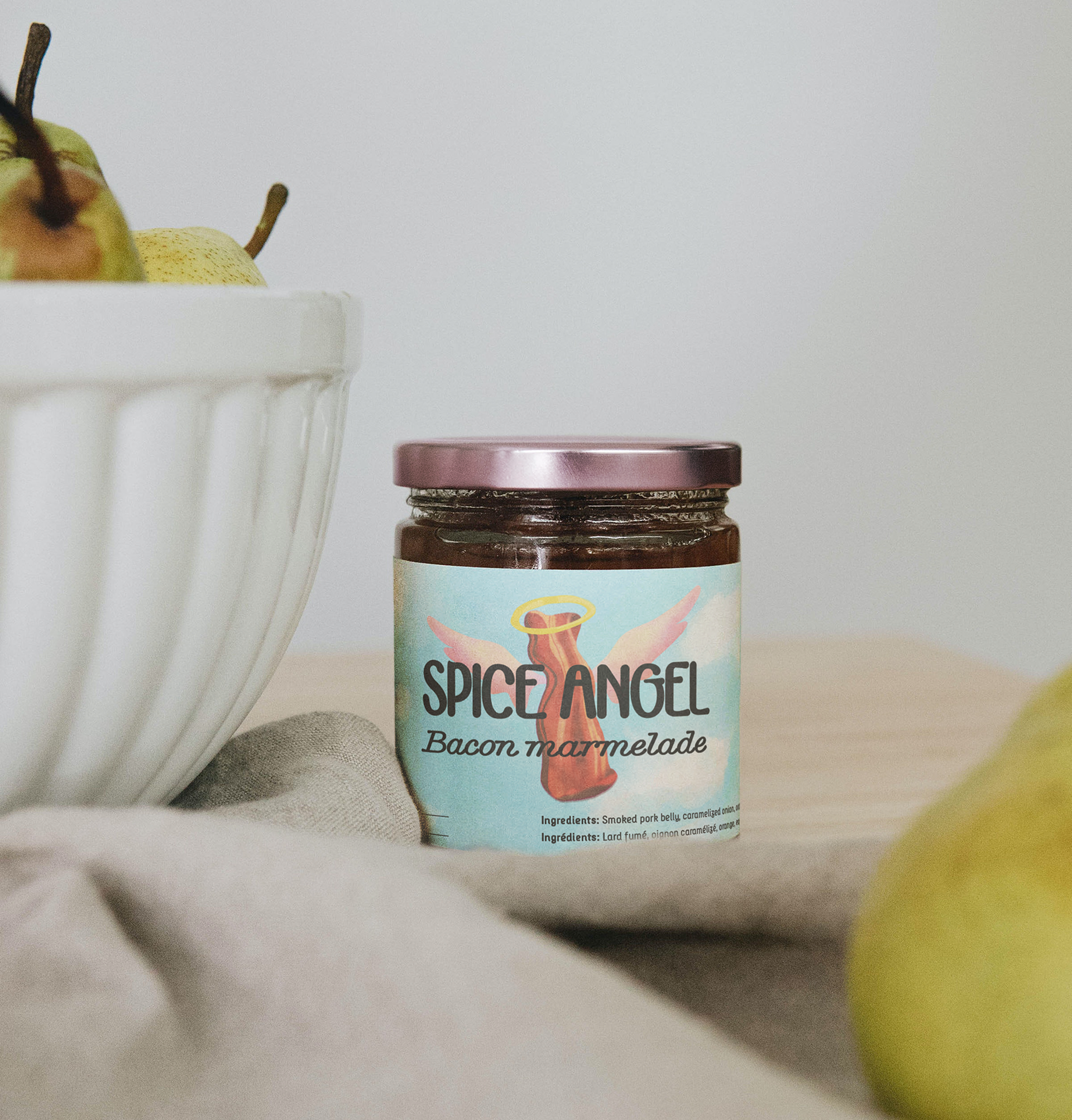
Color palette
Bright colors are used to make the packaging stand out in the market.

Primary colors

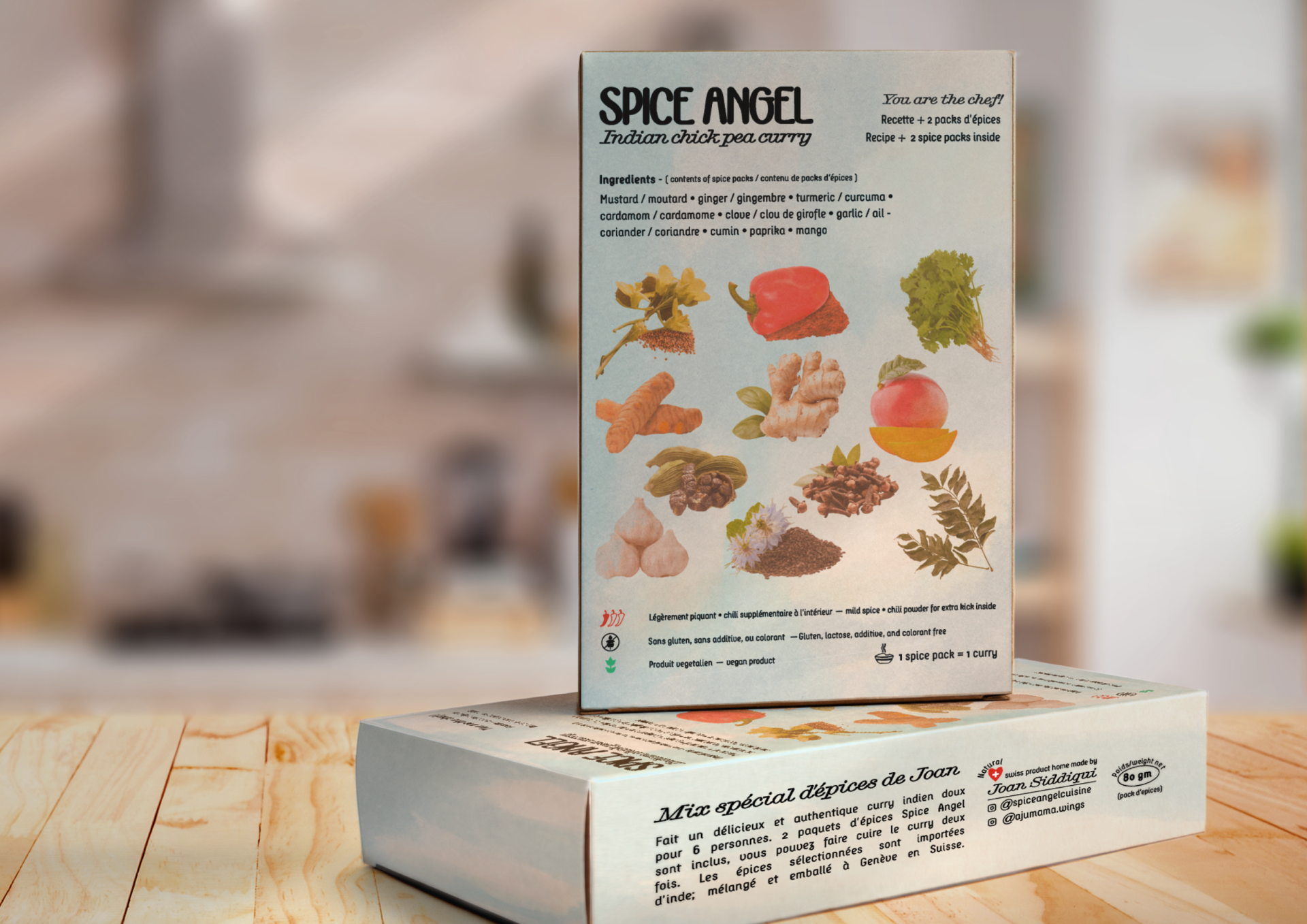
Brand elements: Treated images and custom made illustration
Illustrations are accompanied by grainy/de-saturated, prime ingredients images. These are used in packaging and print material to support the brand world.


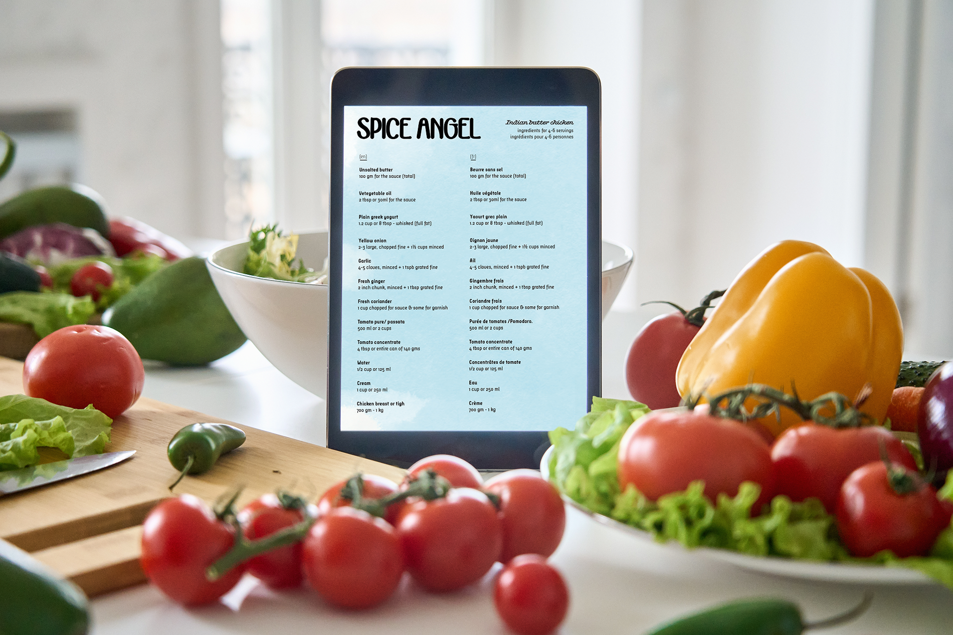
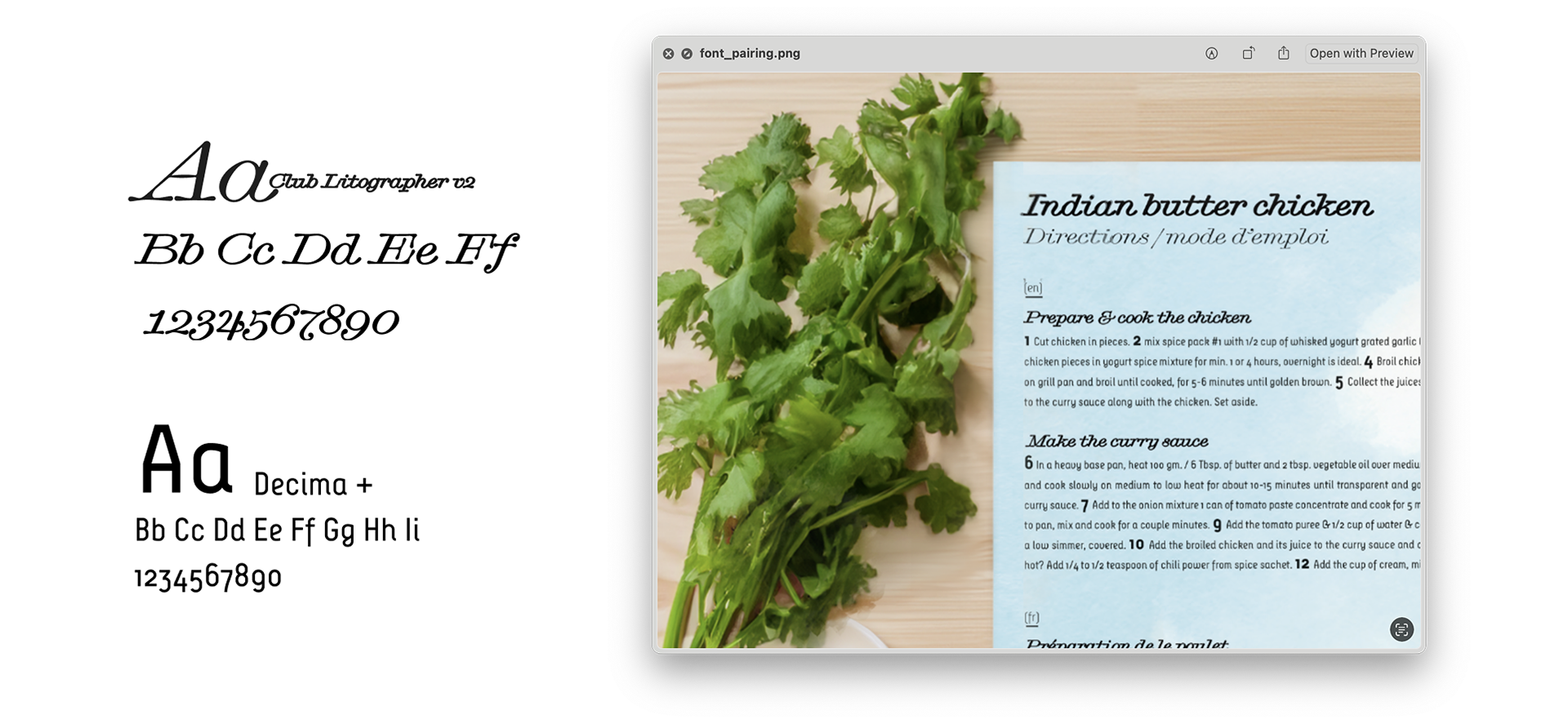
Typography: font pairing
The script font is used to provide a craftsy, warm, french boulangerie feeling. The sans serif provides legibility and structure. Both aim to support and compliment the wordmark in print.

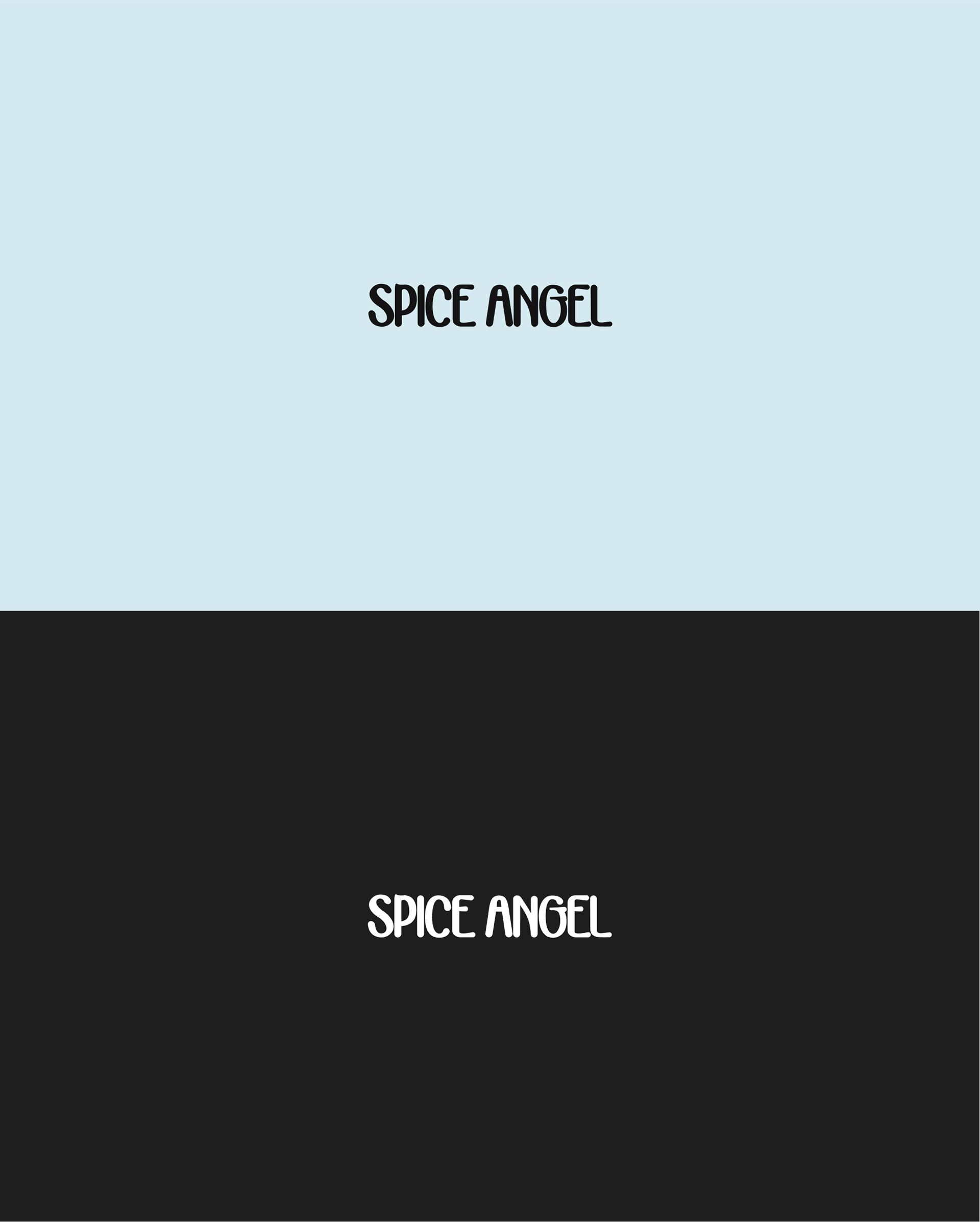
Typography: wordmark
Custom made, visual queues from contemporary Vietnamese typography & brush strokes of classical Korean calligraphy techniques