A Prototype for a CRM - in the Diamond Trade
My role
Product designer / UX researcher
Challenge
Reimagine the internal operating system of a multi-generational diamond company by replacing legacy spreadsheets and fragmented tools with a unified CRM that supports complex workflows, reduces errors, and enables future scale.
Impact highlights
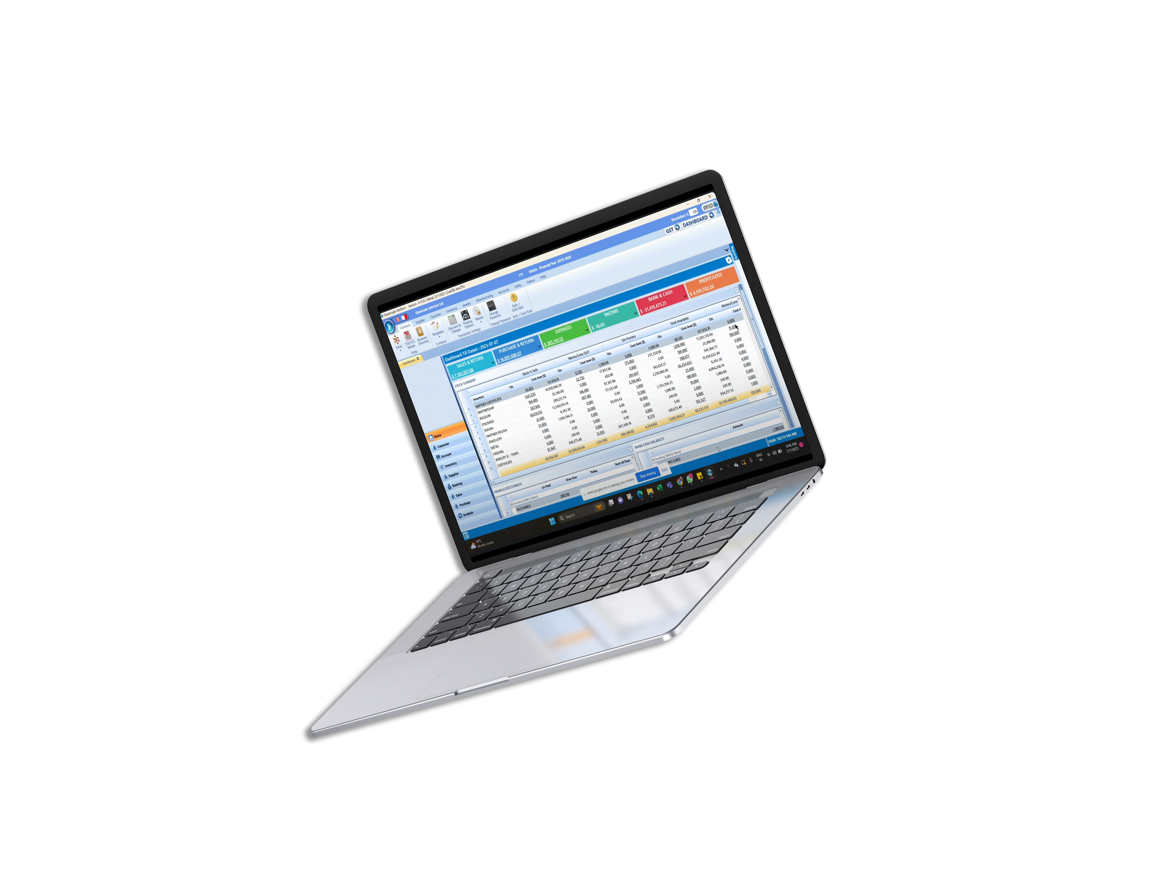
An end-to-end prototype of Atlas CRM: a modular, logic-driven internal tool that maps contacts, inventory, memo creation, and payoff tracking into a scalable system. Validated by stakeholders and ready for development.
Scope
12-week project → user research, interaction design, system mapping, and a functional interactive prototype, collaborating with stakeholders
Skills
Figma, Creative Cloud, typography and layout, atomic design, story-telling, brand strategy, product design thinking, responsive design


Introduction
Atlas is a multi-generational diamond trading business where decades of relationships, instincts, and informal processes have created a powerful but fragile operating model. The goal was to redesign its internal system to reflect the intelligence of its senior traders, codify invisible rules, and allow the next generation to build on what exists—instead of starting from scratch each time.
Atlas was envisioned as a custom-built operating system—part CRM, part inventory manager, part light accounting layer—designed specifically for the emotional, cognitive, and operational reality of diamond traders. While the project never moved beyond the prototype phase, it remains a rich example of scalable UX for complex, high-stakes workflows.

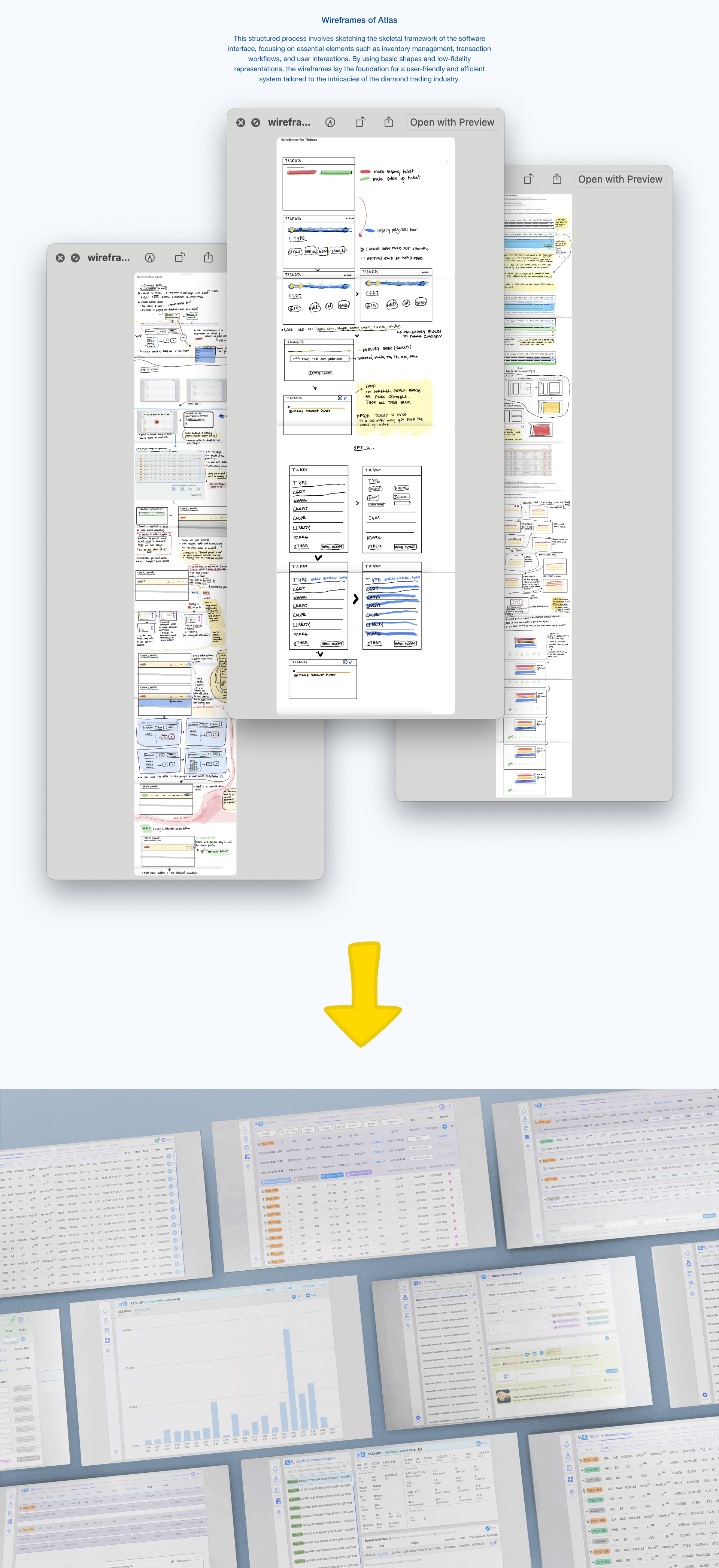
Research - a deep dive into the world of diamonds and jewellery + methodology
Understand and document the tacit knowledge held by senior traders—their decision flows, naming conventions, and mental models.
Identify operational and emotional pain points across memo creation, inventory tagging, follow-up behaviors, and payment reconciliation.
Observe how legacy tools (email, WhatsApp, spreadsheets) serve as both workarounds and sources of risk.
Translate invisible rules into shareable system logic.
Identify system-level tensions: fast vs. safe, intuition vs. structure, trust vs. scale.

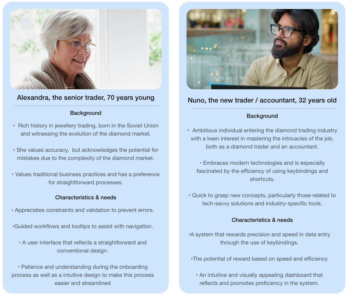
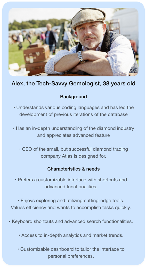
User personas
Map out implicit workflows, both operational and emotional. Discover where the current tools fall short, especially in memo creation, payoff tracking, and team handoffs.

User persona 1

User persona 2

User persona 3

Primary interviews / non-intrusive participant observation
Conducted in-depth interviews with:
Senior trader (legacy logic, fast decisions, resistant to structure)
Ops coordinator (handles real-time data, email, spreadsheet logistics)
Junior trader/apprentice (learning curve, hesitant to act independently)
Owner (bird's-eye view, minimal platform usage but wants accountability)
Senior trader (legacy logic, fast decisions, resistant to structure)
Ops coordinator (handles real-time data, email, spreadsheet logistics)
Junior trader/apprentice (learning curve, hesitant to act independently)
Owner (bird's-eye view, minimal platform usage but wants accountability)

User journey map
"Lorem ipsum dolor sit amet"


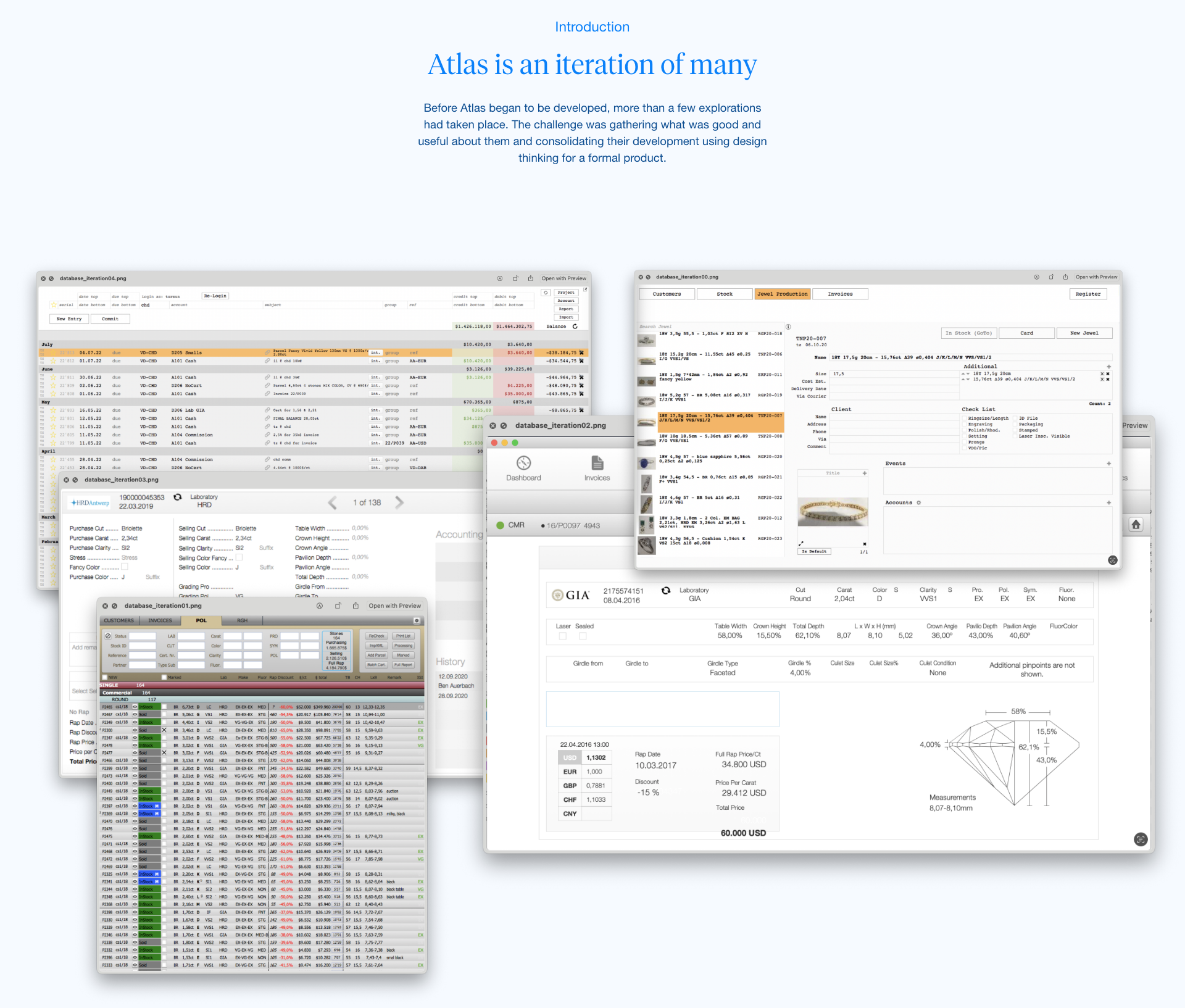
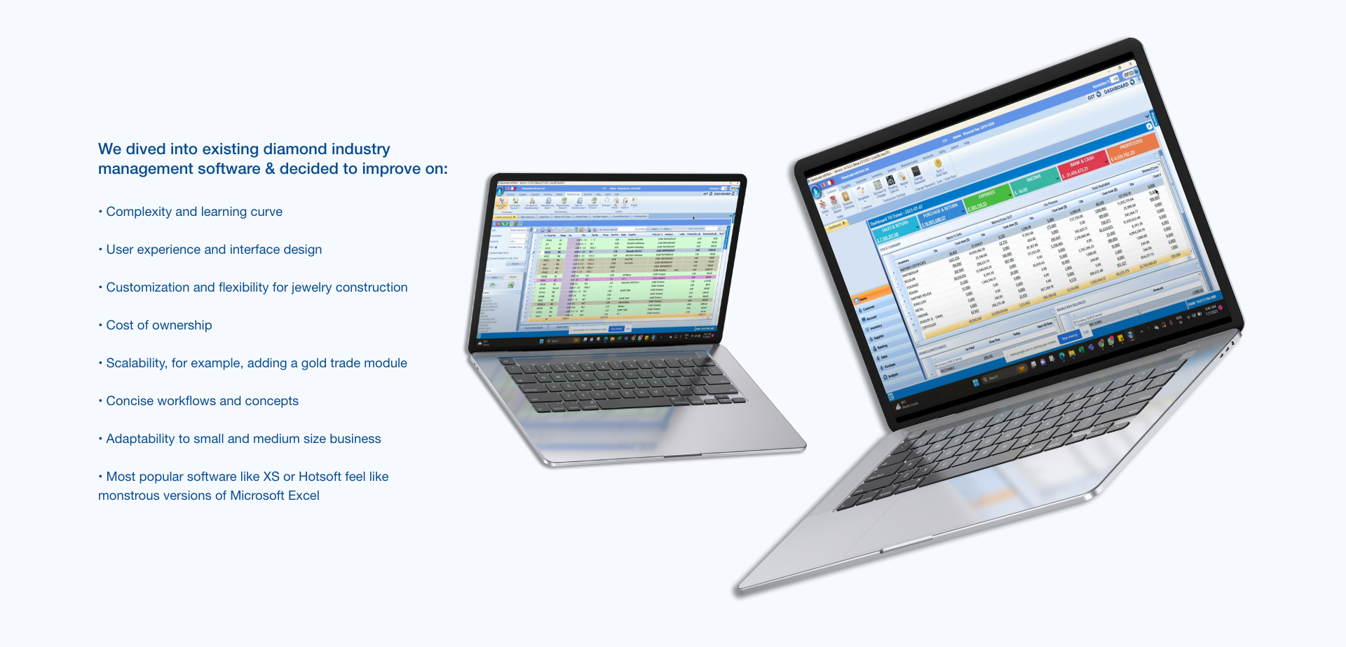
Benchmark study / taxonomy of existing diamond software
•Knowledge transfer was inconsistent. Some naming conventions and rules were known only by the founder.
• Users hesitated to use parts of the system they didn’t fully trust or understand.
• Users hesitated to use parts of the system they didn’t fully trust or understand.

Affinity map
"Lorem ipsum dolor sit amet"


From insights to problem framing

Key insights from deep research
Over a 6-week research sprint, I conducted immersive, observational, and generative research inside the company. Drawing from stakeholder interviews, real-time usage patterns, and 1:1 collaborative prototyping sessions, several core themes emerged:
Emotional Frictions
•Follow-ups are emotionally charged. Users often delay reminders to avoid damaging relationships—even when money is owed.
• Personal relationships override formal structures; clarity is needed, but so is flexibility.
•Follow-ups are emotionally charged. Users often delay reminders to avoid damaging relationships—even when money is owed.
• Personal relationships override formal structures; clarity is needed, but so is flexibility.
Cognitive Load
• Traders often store logic in their heads. Their workflow depends on pattern recognition, not databases.
• Users felt overwhelmed by overly dense UI— Too much backend info feelds overwhelming so we need systems in place
• Traders often store logic in their heads. Their workflow depends on pattern recognition, not databases.
• Users felt overwhelmed by overly dense UI— Too much backend info feelds overwhelming so we need systems in place
Behavioral Patterns
•Information often exists in multiple systems or messaging apps (WhatsApp, PDF memos, etc).
• Traders rely heavily on tags, shapes, and reference naming conventions to understand context.
•Information often exists in multiple systems or messaging apps (WhatsApp, PDF memos, etc).
• Traders rely heavily on tags, shapes, and reference naming conventions to understand context.
Learning & Onboarding
•Knowledge transfer was inconsistent. Some naming conventions and rules were known only by the founder.
• Users hesitated to use parts of the system they didn’t fully trust or understand.
•Knowledge transfer was inconsistent. Some naming conventions and rules were known only by the founder.
• Users hesitated to use parts of the system they didn’t fully trust or understand.

Problem statement and northstar HMW
•Knowledge transfer was inconsistent. Some naming conventions and rules were known only by the founder.
• Users hesitated to use parts of the system they didn’t fully trust or understand.
• Users hesitated to use parts of the system they didn’t fully trust or understand.

Design strategy and logic

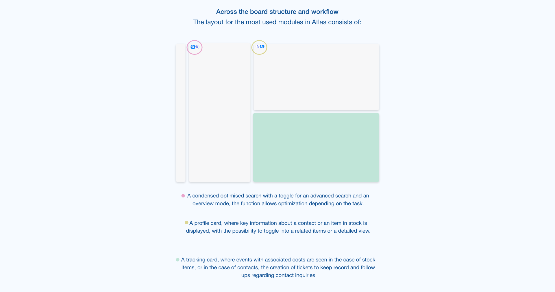
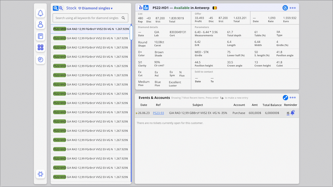
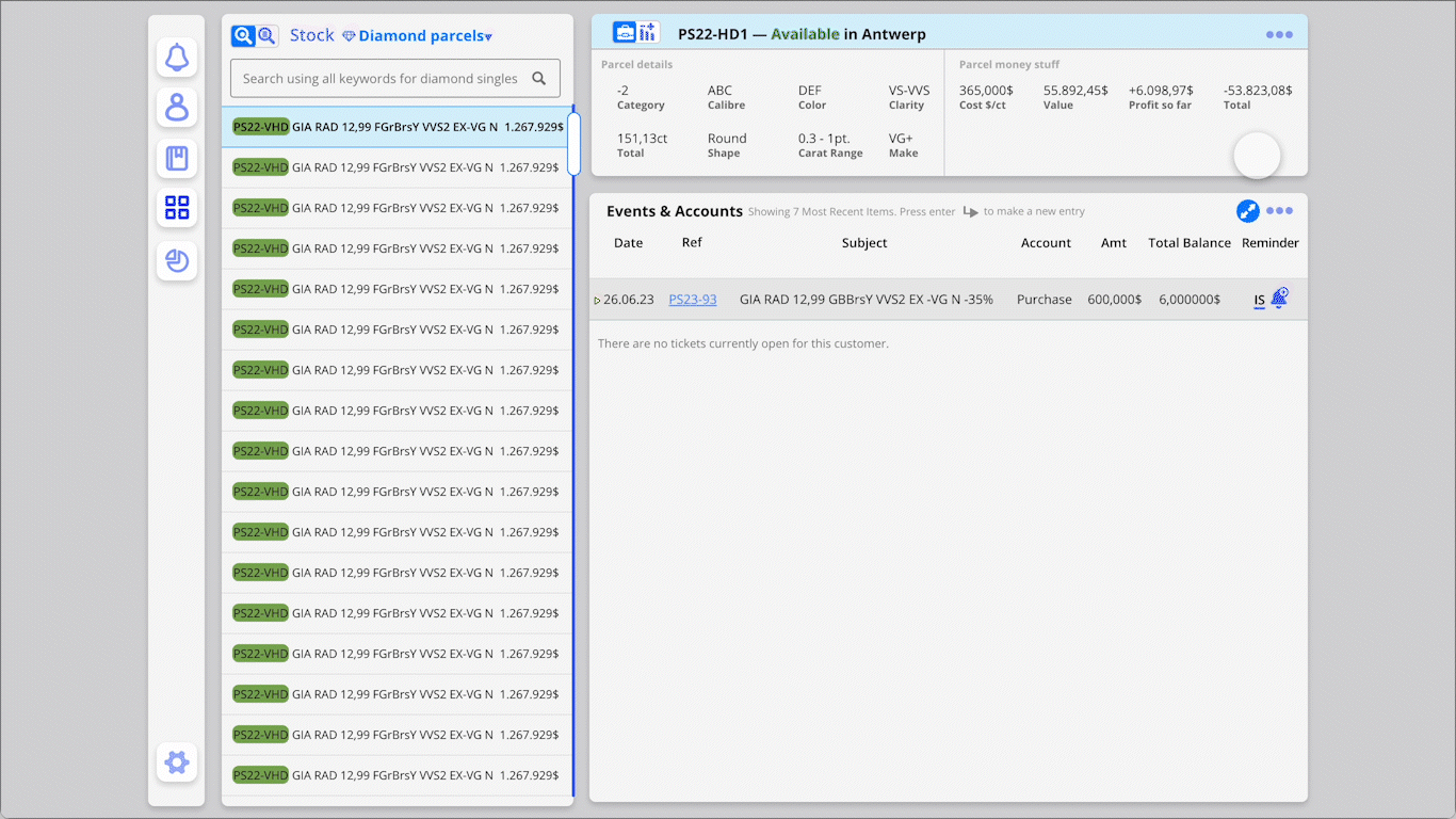
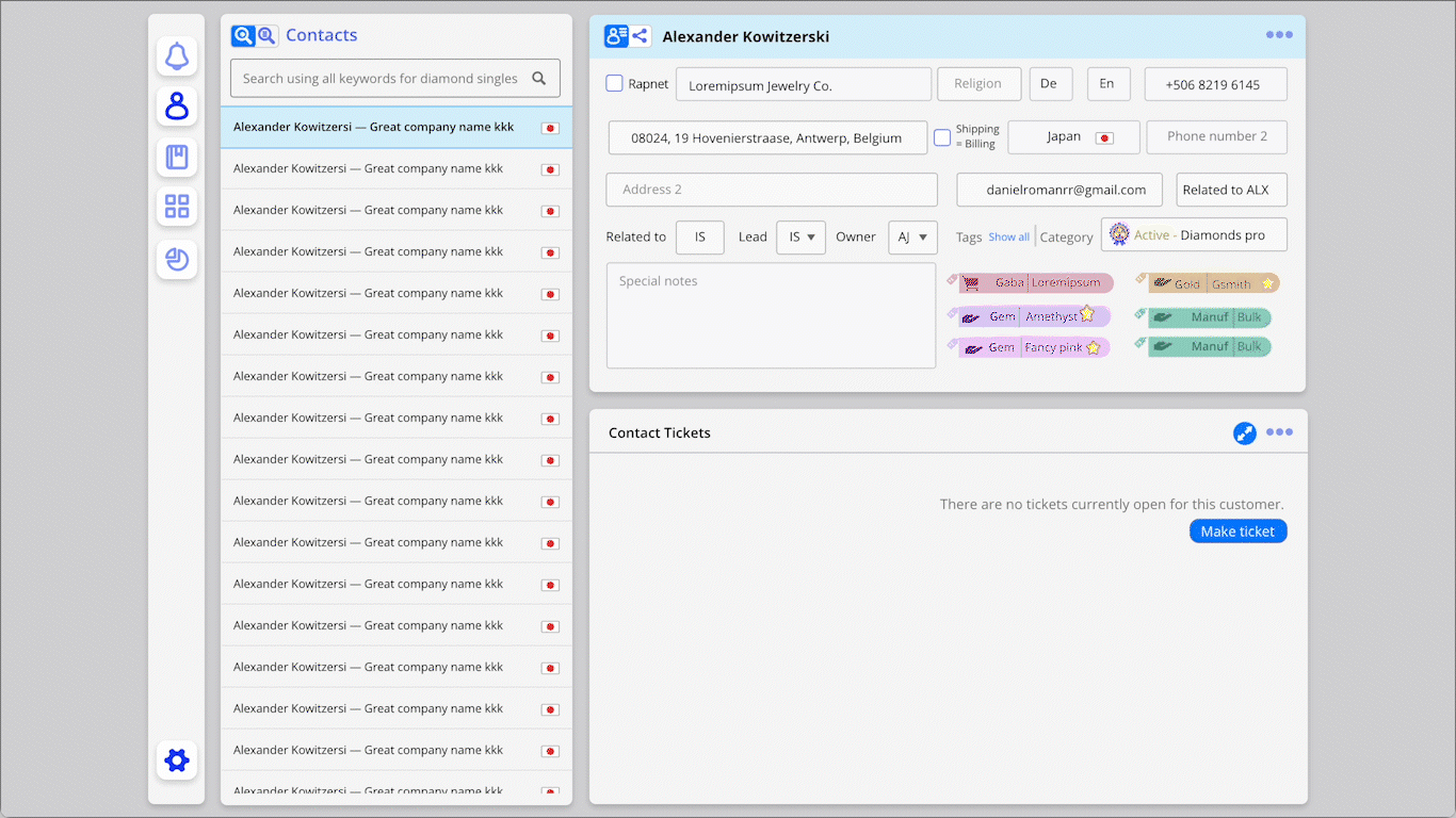
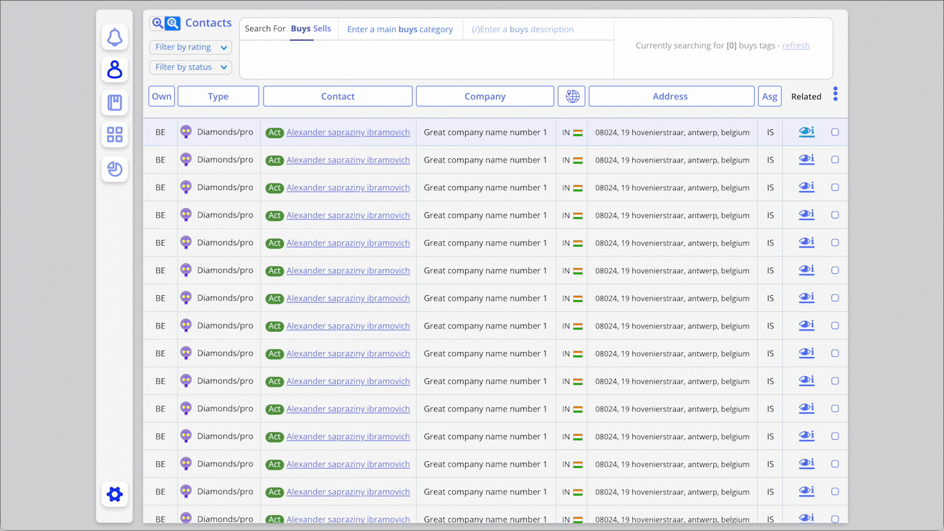
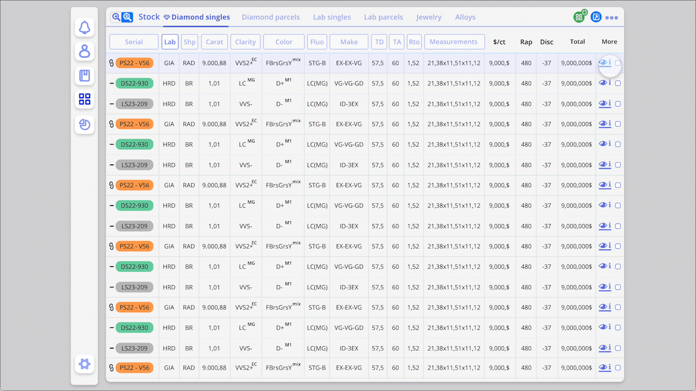
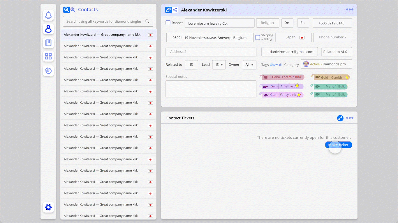
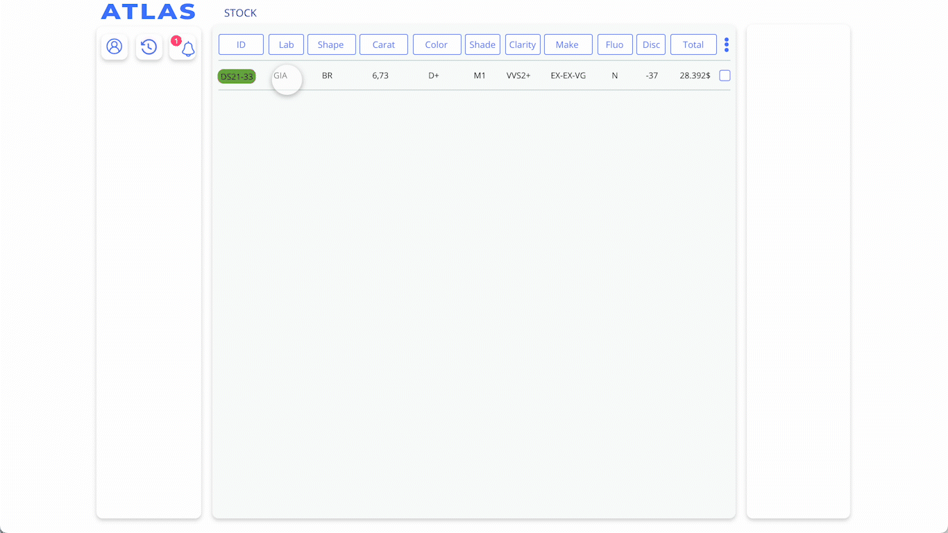
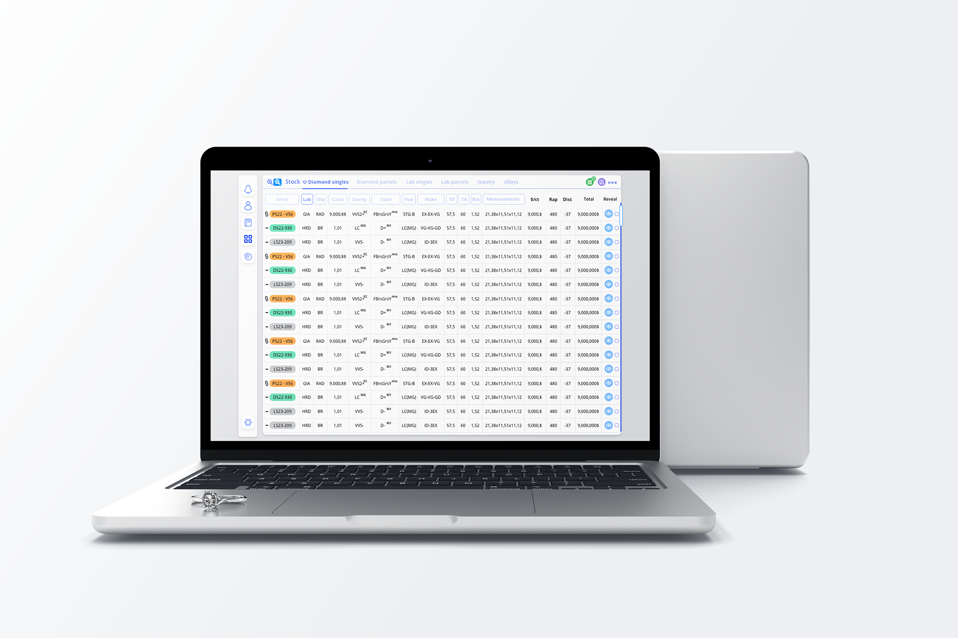
One Interface, Two Modes: Spreadsheet vs. Profile
bulk scanning and deep object analysis. We implemented a universal toggle pattern that allowed users to fluidly switch between a spreadsheet-style overview (for quick filtering and selections) and a detailed profile view (for editing, tagging, and reviewing object metadata).
• This mode toggle is consistently placed and behaves identically in Stock, Contacts, Tags, and Clients — enabling muscle memory and lowering cognitive load.
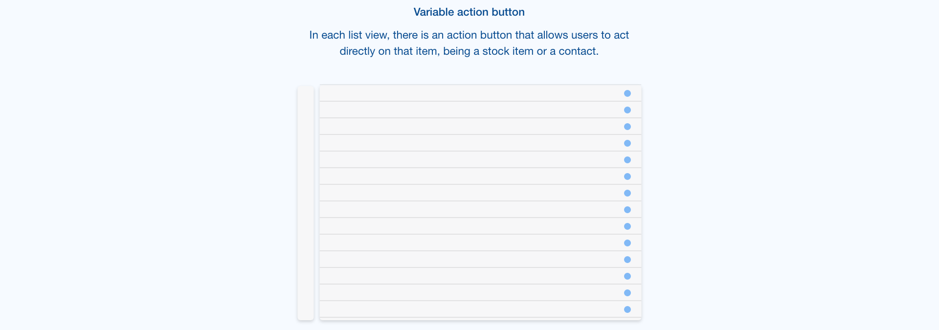
• Design elements like the Reveal Button within table rows allow users to expand detail views inline without losing context — making layered data accessible without overwhelming.


Layered Complexity Through Shared UI Patterns
Consistency breeds confidence
We used the same UI logic to govern how information is revealed, hidden, and prioritized across modules:
We used the same UI logic to govern how information is revealed, hidden, and prioritized across modules:
Toggle buttons were used not only for switching views, but for managing preview panes, tag categories, and memo inbox visibility.
Each module (e.g. Stock and Contacts) shares a structural layout: sidebar → filter layer → spreadsheet → inline detail. This harmony allowed interface patterns to repeat meaningfully.
• • The result? Traders could anticipate interactions, predict system behavior, and onboard faster with less documentation.


Standardized Language for Structured Search
Industry vocabulary becomes system grammar
Each stock item — whether a parcel or a single stone — is composed from a controlled set of tokenized descriptors (e.g., “3ct,” “VVS,” “3x,” “GIA,” etc).
Each stock item — whether a parcel or a single stone — is composed from a controlled set of tokenized descriptors (e.g., “3ct,” “VVS,” “3x,” “GIA,” etc).
These act like a grammar for stock creation and search, reducing user error and aligning internal naming with external industry communication.
The same descriptors enable auto-tagging, advanced filtering, and potential AI-based prediction models.
• • Stock input forms are optimized around this language, providing dropdowns and smart autofill logic to accelerate entry and enforce coherence.


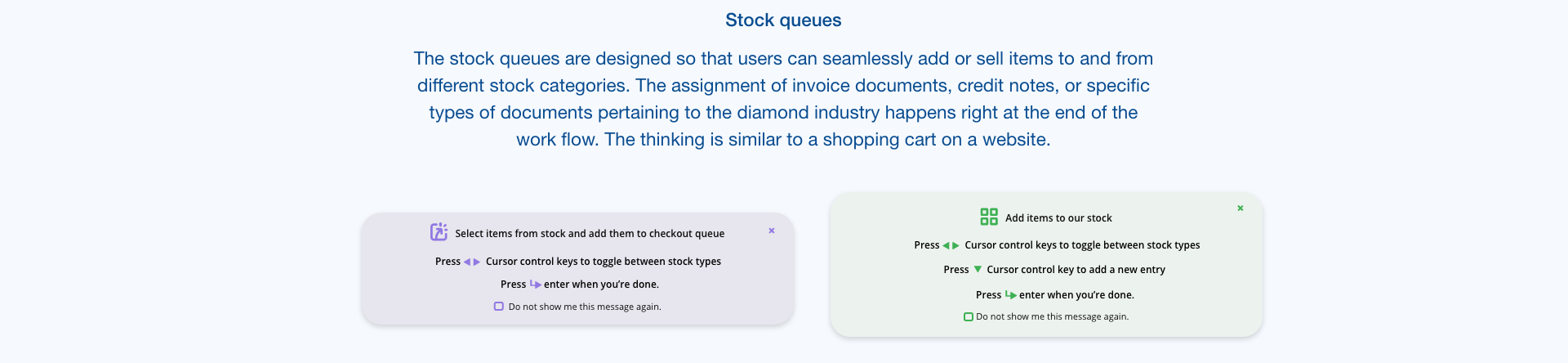
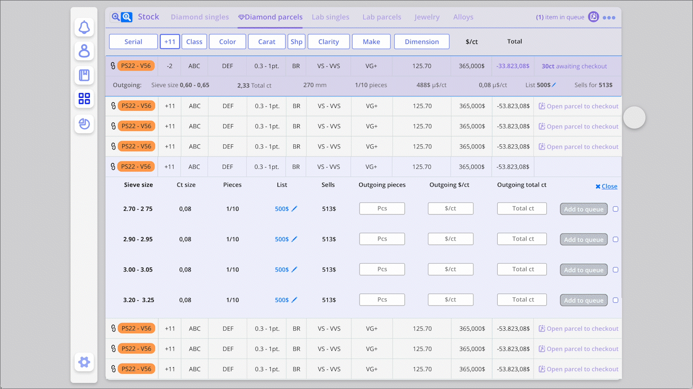
🛒 4. Queue as Sale & Intake Engine
Atlas Queue = Shopping cart meets diamond SOPs
The Queue system operates as a temporary workspace for preparing both sales and intakes from the Stock.
The Queue system operates as a temporary workspace for preparing both sales and intakes from the Stock.
Traders can add items from Singles or Parcels views, just like a shopping cart.
At checkout, each item is processed with tailored industry documentation types: Memo In, Memo Out, On Lease, Rented, etc.
The same “Reveal Button” pattern is used to access item details before confirming.
• • This system acts as a cognitive anchor, letting users focus on batch actions while ensuring accountability (nothing is lost, all metadata travels with the object).


5. Microinteractions that Reward Mastery
Satisfying speed, subtle feedback
To build flow for expert users, we introduced microinteractions that reward precision and confidence:
To build flow for expert users, we introduced microinteractions that reward precision and confidence:
Tag editing uses real-time visual cues (highlight, color feedback)
Memo creation confirms with progressive disclosure — helping users stay aware of their flow
The UI subtly “celebrates” completed actions with visual hints — not gamified in a cartoonish way, but elegant and trustworthy.
🎞️ GIF: Creating a Ticket, editing tags


Interface & Interactions
If Design Strategy was about establishing the rules of the world, Interface & Interaction is where those rules become real. Every toggle, token, and transition is grounded in the mental models and modular logic described earlier. What follows is a closer look at how these design principles show up.

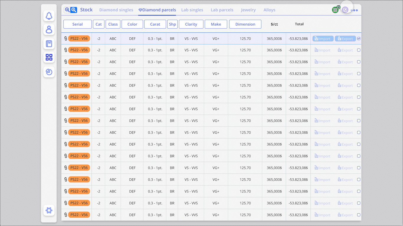
🔎 Advanced Search & Stock Navigation
Dual Mode Interface: Spreadsheet + Profile
Traders toggle between high-density spreadsheet views and full-detail profiles.
Actions are always anchored in the same zone: "Reveal" buttons sit consistently to the left, reinforcing habit.
Standardized tokens (e.g., "3x VVS1") make filtering intuitive.
🔍 Tokenized Input System
Controlled Vocabulary Made Visual
Instead of free text, users select from predefined building blocks.
The UI validates and formats input in real time, avoiding costly errors.
These descriptors double as filters and tags elsewhere in the system.
🗃️ The Queue as Checkout & Intake
One Queue, Two Directions
Acts like a shopping cart: add items from Singles or Parcels.
Upon checkout, the system prompts tailored documentation logic: memo out, memo in, lease, sale, etc.
Behavior follows consistent pattern logic: everything previewed before submission.
💬 Communication & Notifications System
Microfeedback Loops
Users receive inline confirmations and dynamic feedback for every action: tag added, client updated, note saved.
Status banners and toast messages are subtle but persistent until user acknowledges.
🔢 Offer System Logic
Layered Interaction for Power Users
Traders can group, copy, preview, and re-offer stones within nested deal views.
Interface reveals more only when needed — progressive disclosure to reduce overwhelm.
Each offer preserves state across sessions and devices.
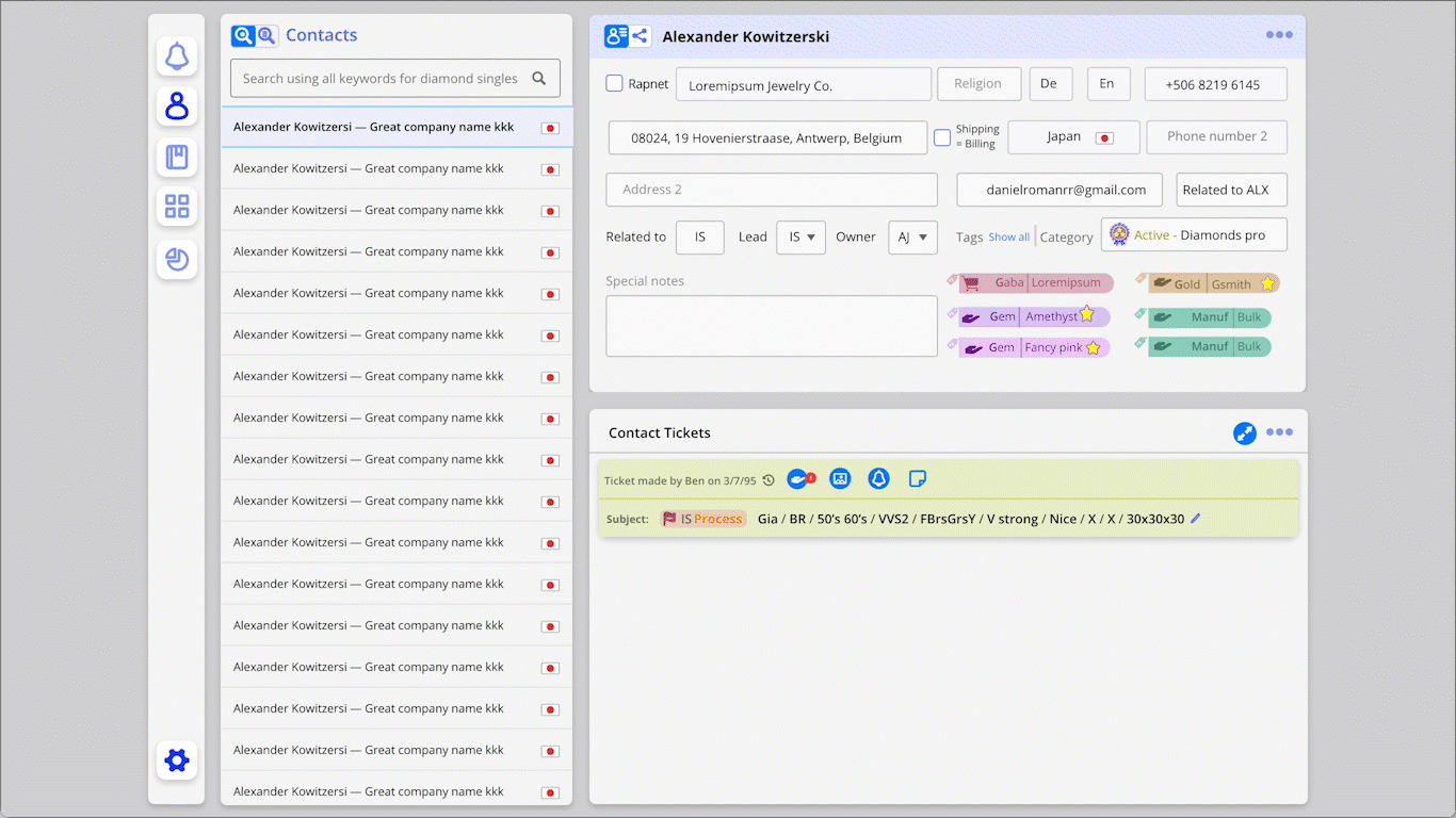
📃 Tags as Filters, Notes & Smart Memory
Tags = Lightweight Intelligence
Auto-tagging flows from the vocabulary system.
Tags can act as filters, CRM memory, or action triggers.
Visual and contextual, but never overwhelming.